Navigating the dashboard
The dashboard provides a web interface for all the relevant levels of granularity about your QPUs, from an overview of your QPUs and workflows, to the results of individual experiments from a single node of a given workflow run.
We first present the three main panes and then give a tour of all the subpanes.
Overview
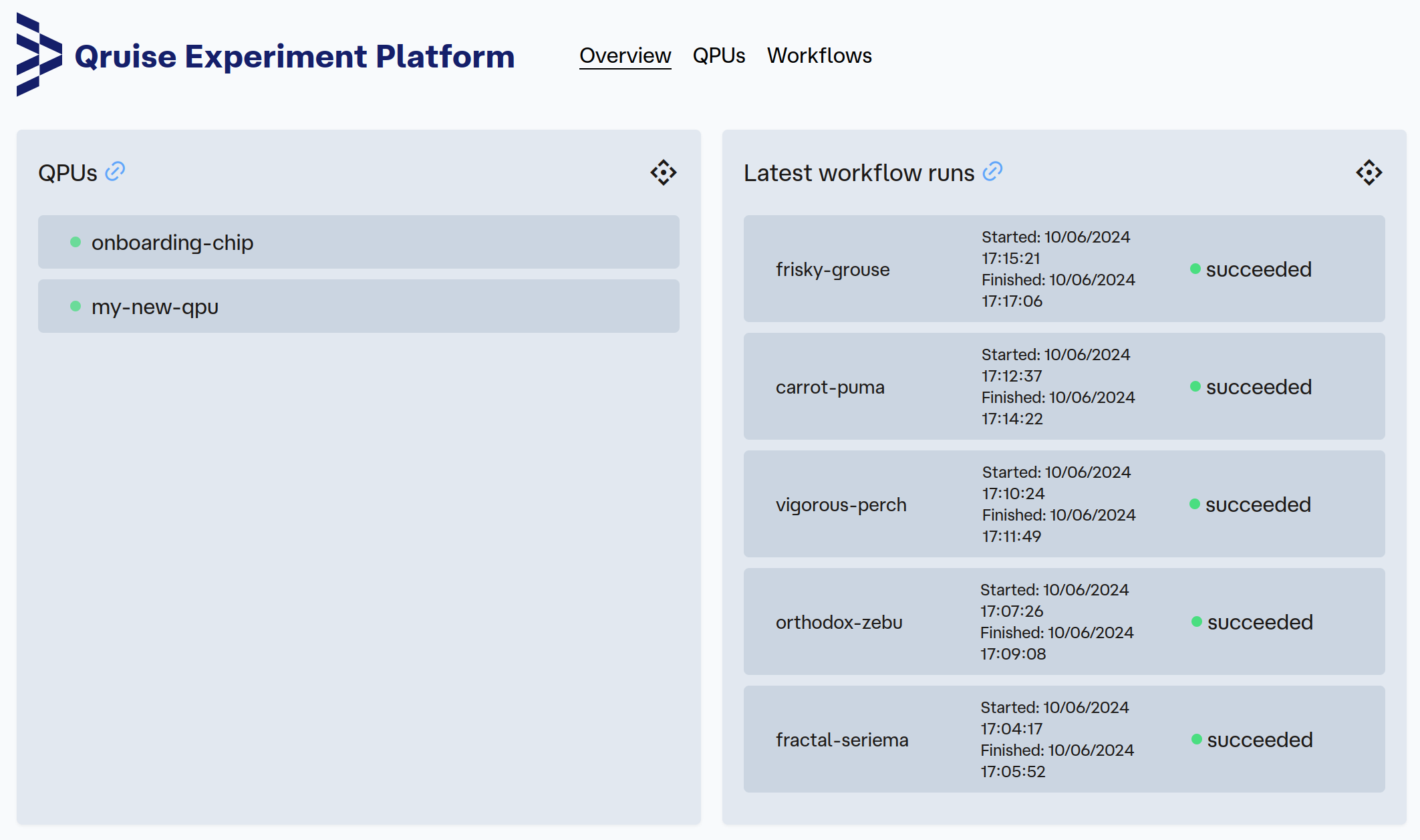
This pane provides a quick view of available QPUs on the left-hand side and the most recently run workflows on the right-hand side.
QPUs
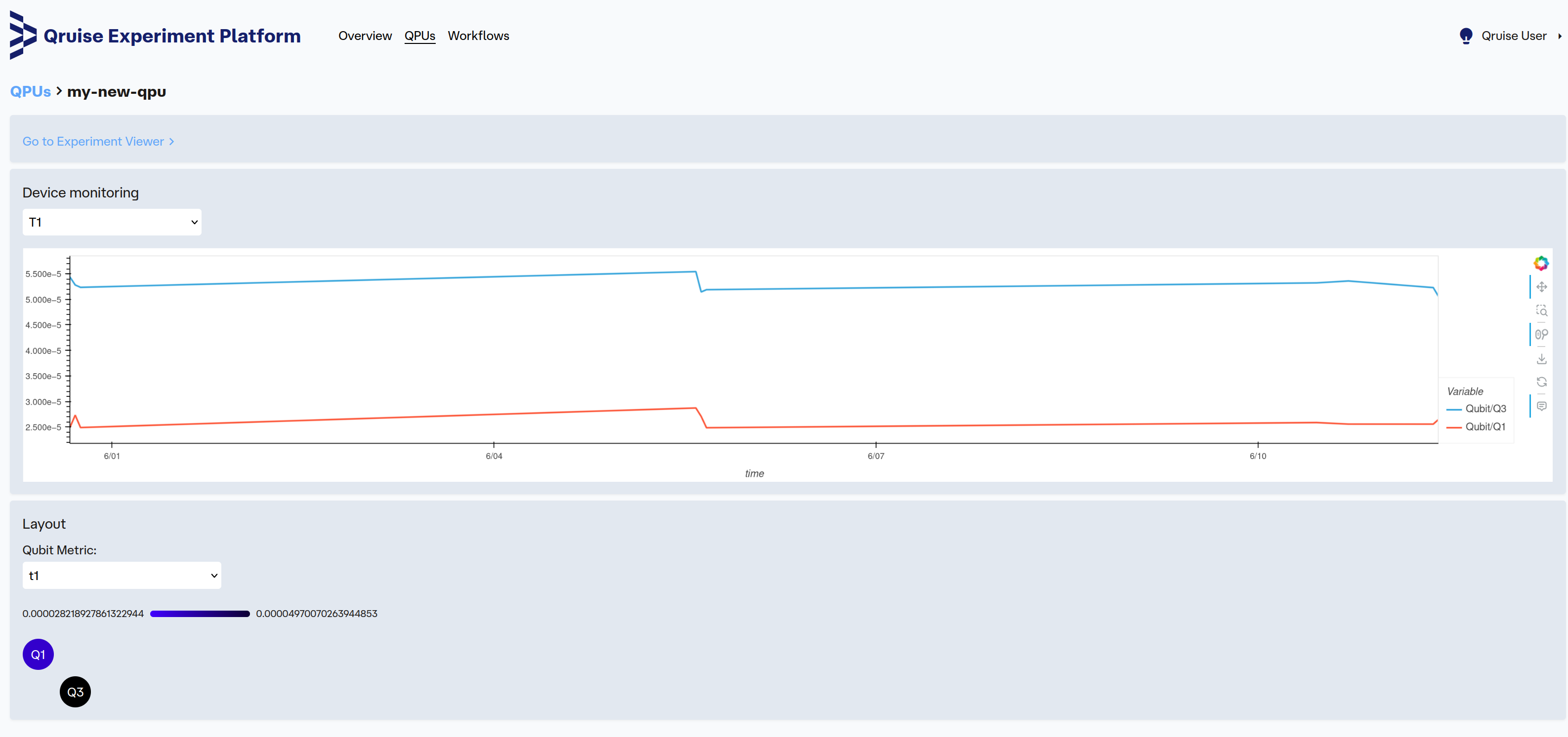
Focusing on a single QPU leads to a monitoring page with two panels:
- the device monitoring panel with time series plots of all main qubit metrics (like T1, frequency, anharmonicity, etc.)
- the layout panel with a heatmap of all qubits in the chip with their connectivity. The heatmap displays latest values of all qubits for the selected characterization metric.
Click on Go to Experiment Viewer to delve more deeply into experiments that led to these qubit parameter estimations.
Workflows
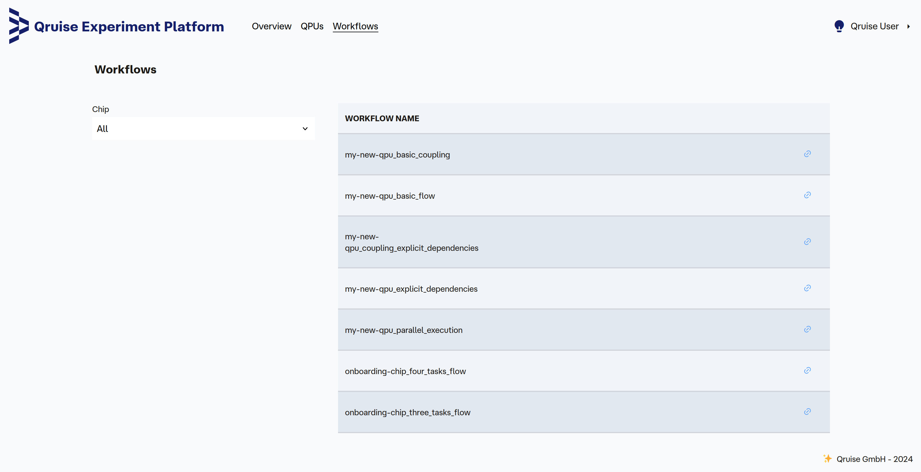
When selecting the Workflows pane, you get a full list of the currently defined workflows. If needed, it's possible to filter this list by QPU chip.
Workflow runs list
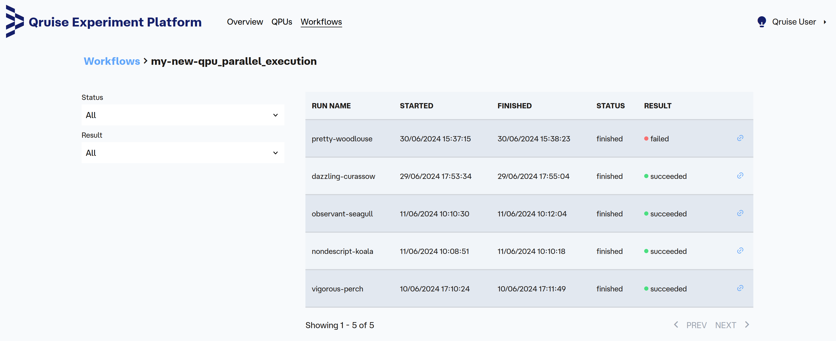
When selecting a specific workflow on the Workflows pane, we then see all the workflow runs with their start and end time.
 On this pane, you can also see currently executing workflows, which will then have a running status.
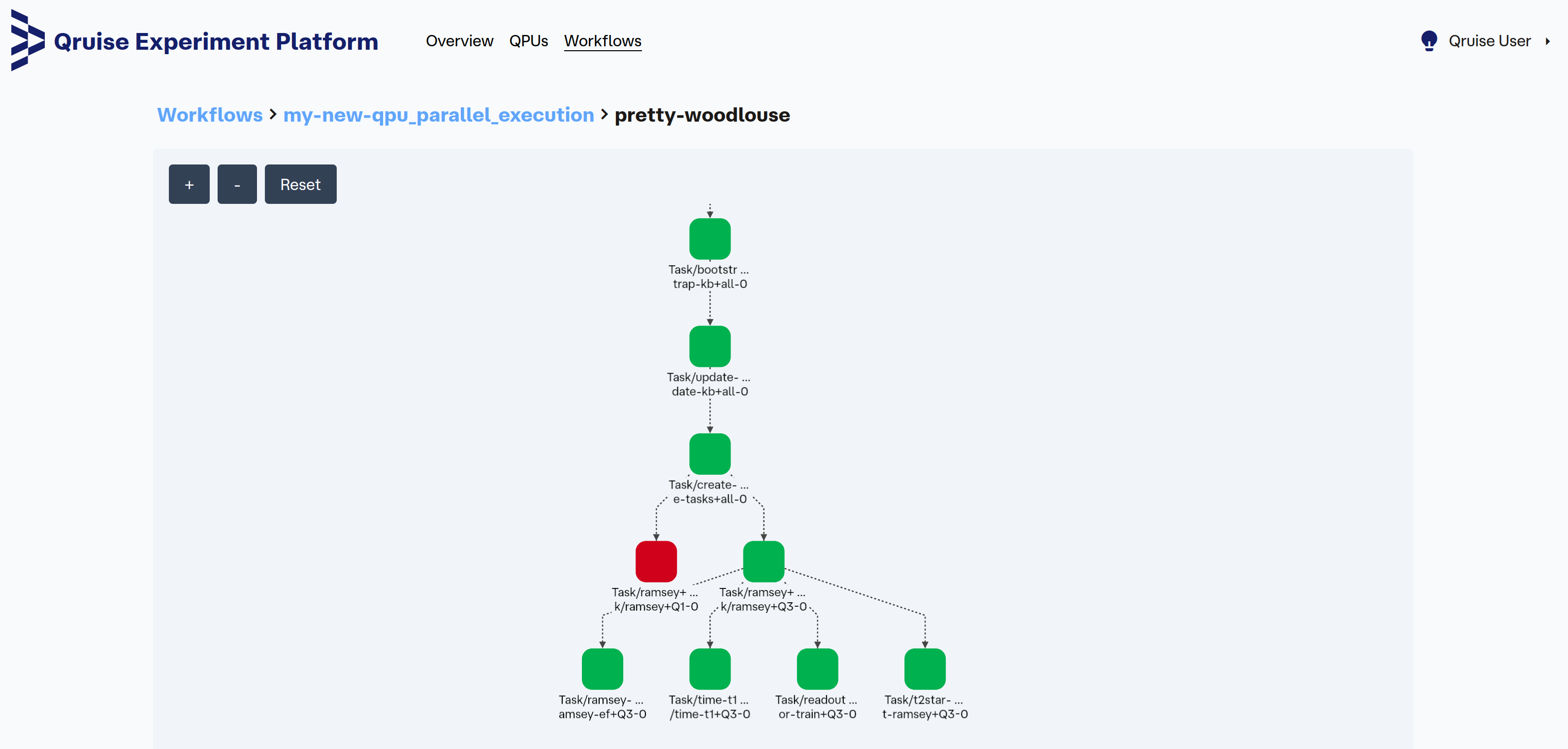
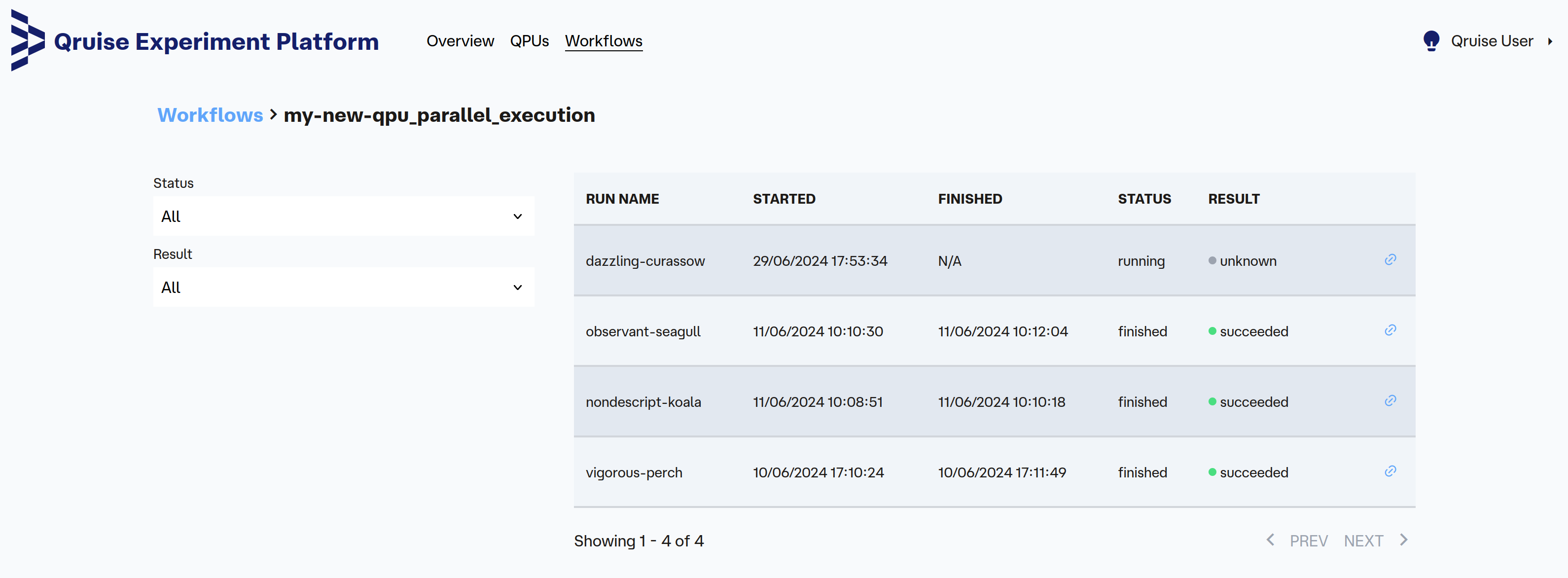 The Result column indicates if this workflow run completed sucessfully. For example, in the following screen capture, the worlflow run pretty-woodlouse failed.
Workflow view
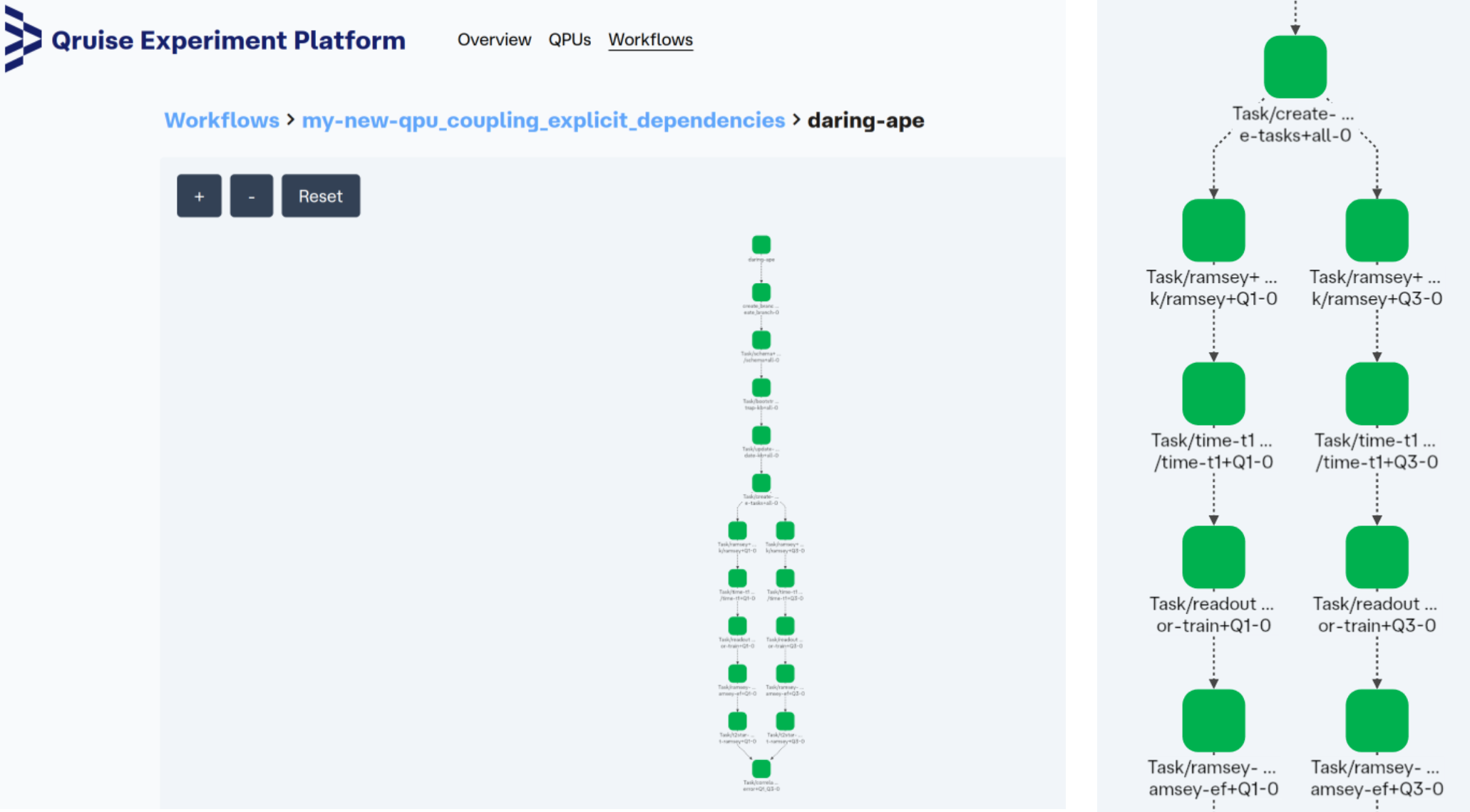
When you select a workflow run, you can see its execution graph (left-hand side figure), which is in the form of a directed acyclic graph (DAG). The right-hand side figure is a zoom of the execution graph screen capture. The chronological order is mainly from top to bottom. Each node corresponds to a task that can be an experiment (made of measurement, analysis and persistance of the data, i.e. saving it so it can be used later) or a numerical simulation (for example, in the case of offline optimal control based on current QPU knowledge).
When a workflow run failed (like pretty-woodlouse in this screen capture), tasks that failed appear in red so that the user can quickly spot where the flow was interrupted.
Node view
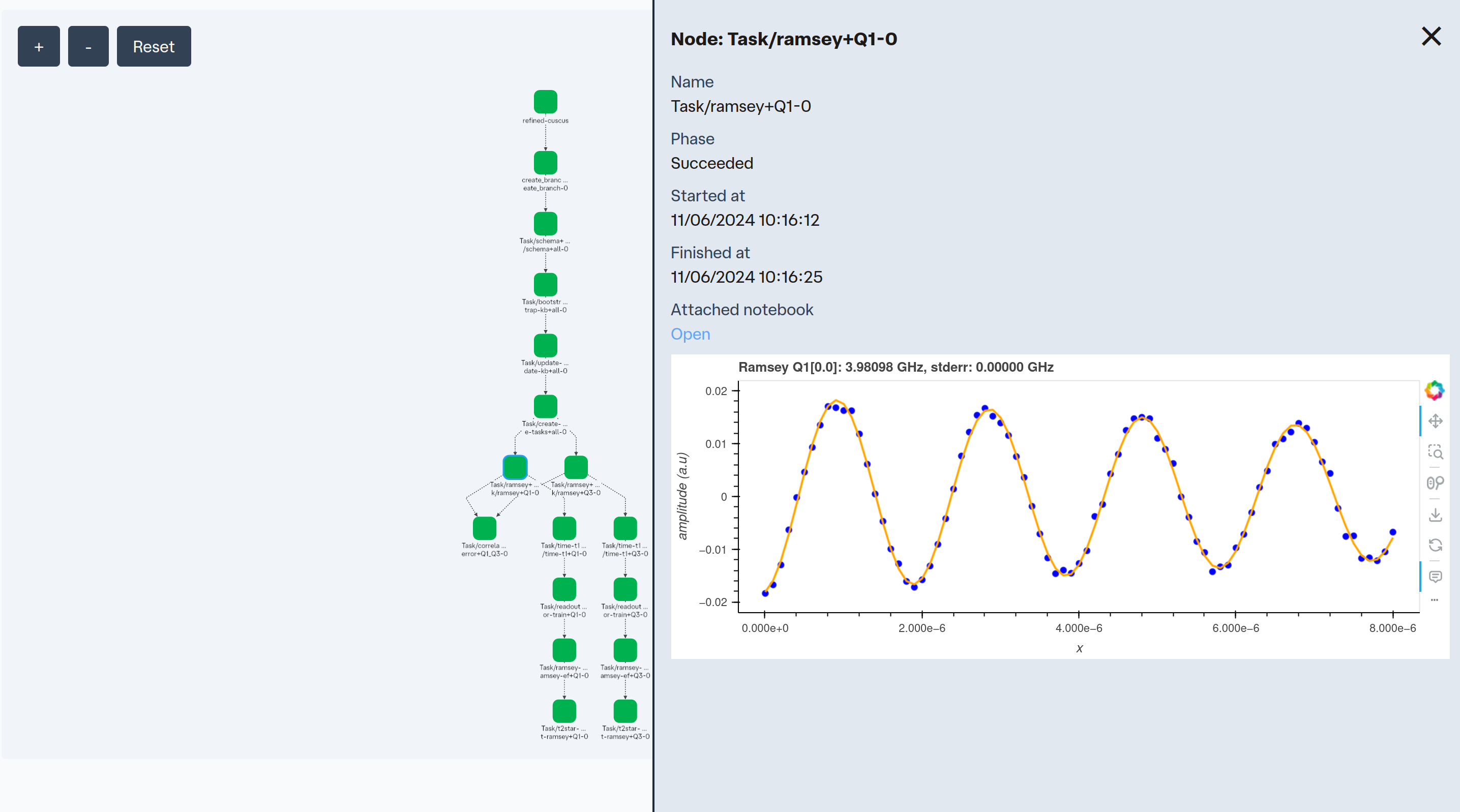
For every node in the workflow view, you can click and see the related task start and end time. Relevant plots of the experimental data and analysis may also be shown here.
Tip
Click "Open" under "Attached notebook" to see the exact notebook that was executed. This is useful for debugging and checking configuration.
Experiment viewer
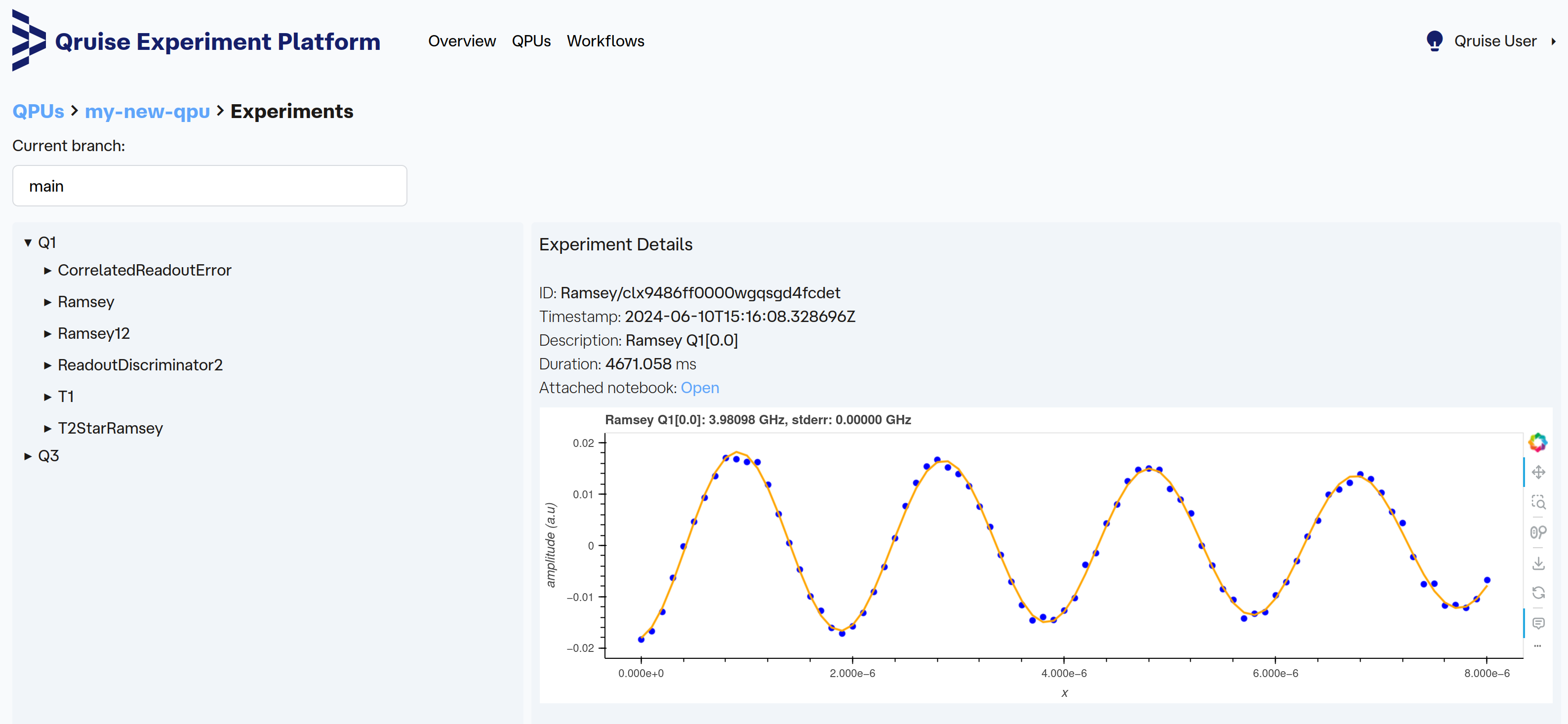
When focusing on a specific QPU, either through the QPUs pane or by selecting a QPU on the Overview pane, we get a link to the Experiment Viewer. This is a way to conveniently navigate through all experiments run on a specific qubit. It provides a similar view to the Node view but is organised by qubit/experiments rather than workflow/nodes.
Tip
If you want to load raw and analysis data from a particular experiment, you can just copy/paste its ID and use session.load_document(ID).
In the case of the Ramsey experiment just above, the complete snippet would be:
